What's the meaning of the LinkedIn Logo »
LinkedIn Logo
This page is about the meaning, origin and characteristic of the symbol, emblem, seal, sign, logo or flag: LinkedIn Logo.
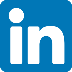
LinkedIn is a social networking platform designed for professionals and businesses to connect, communicate, and network with each other. It is primarily used for professional networking, job searching, recruiting, and career development.
The LinkedIn logo is a stylized icon that features the brand name "LinkedIn" in bold, dark blue letters, accompanied by an abstract image of an "in" symbol. Here are some detailed characteristics of the logo:
Color: The LinkedIn logo uses a distinct shade of blue known as "LinkedIn Blue," which is a dark shade of blue that is highly recognizable. The blue color is associated with professionalism, trustworthiness, and reliability.
Font: The LinkedIn wordmark is set in a custom sans-serif font that features rounded edges and a clean, modern look. The letters are bold and highly legible, making it easy to read the brand name even at smaller sizes.
Icon: The "in" symbol that accompanies the LinkedIn wordmark is an abstract image that resembles a person with their arms outstretched. The symbol is intended to represent the idea of "connecting" with others, which is a core value of the LinkedIn platform.
Spacing: The spacing between the letters in the LinkedIn wordmark is carefully balanced to create a sense of harmony and unity. The letters are spaced close enough to be read as a single word, but not so close that they appear crowded or difficult to read.
Scalability: The LinkedIn logo is designed to be highly scalable, which means it can be used at a variety of sizes without losing clarity or detail. The logo is often used in small sizes, such as in mobile apps and social media icons, as well as larger sizes for billboards and other marketing materials.
Overall, the LinkedIn logo is a highly recognizable and iconic symbol that reflects the platform's values of professionalism, connectivity, and innovation.
- 294 Views
Graphical characteristics:
Asymmetric, Closed shape, Colorful, Contains both straight and curved lines, Has no crossing lines.
Categories: Corporate Brands, Websites.

More symbols in Corporate Brands:
Just as a nation's flag expresses the distinct identity of a country, so, too, a logotype — typically a symbol or letters — helps to establish the name and define the character of a corporation. Effe… read more »
More symbols in Websites:
Websites logos read more »
Citation
Use the citation below to add this symbol to your bibliography:
Style:MLAChicagoAPA
"LinkedIn Logo." Symbols.com. STANDS4 LLC, 2025. Web. 22 Feb. 2025. <https://www.symbols.com/symbol/linkedin-logo>.







Have a discussion about LinkedIn Logo with the community:
Report Comment
We're doing our best to make sure our content is useful, accurate and safe.
If by any chance you spot an inappropriate comment while navigating through our website please use this form to let us know, and we'll take care of it shortly.
Attachment
You need to be logged in to favorite.
Log In