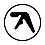
What's the meaning of the Aphex Twin logo »
Aphex Twin logo
This page is about the meaning, origin and characteristic of the symbol, emblem, seal, sign, logo or flag: Aphex Twin logo.

Aphex Twin, the London-based producer, whose real name is Richard David James, is recognised for his amorphic logo – created by graphic designer Paul Nicholson – that vaguely resembles the letter "A".
Originally conceived in 1991, the Aphex Twin logo was hand-drawn by Nicholson using circle templates and rulers.
- 4,044 Views
Graphical characteristics:
Asymmetric, Closed shape, Monochrome, Contains both straight and curved lines, Has no crossing lines.
Category: Corporate Brands.

More symbols in Corporate Brands:
Just as a nation's flag expresses the distinct identity of a country, so, too, a logotype — typically a symbol or letters — helps to establish the name and define the character of a corporation. Effe… read more »
Citation
Use the citation below to add this symbol to your bibliography:
Style:MLAChicagoAPA
"Aphex Twin logo." Symbols.com. STANDS4 LLC, 2025. Web. 9 Mar. 2025. <https://www.symbols.com/symbol/aphex-twin-logo>.


Have a discussion about Aphex Twin logo with the community:
Report Comment
We're doing our best to make sure our content is useful, accurate and safe.
If by any chance you spot an inappropriate comment while navigating through our website please use this form to let us know, and we'll take care of it shortly.
Attachment
You need to be logged in to favorite.
Log In