What's the meaning of the Google Chrome Logo »
Google Chrome Logo
This page is about the meaning, origin and characteristic of the symbol, emblem, seal, sign, logo or flag: Google Chrome Logo.
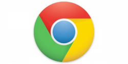
Google Chrome is a web browser developed by Google. It was first released in 2008 and has since become one of the most popular browsers in the world, with over 60% of the market share as of 2021. Google Chrome is available for Windows, Mac, Linux, and mobile devices, and is known for its speed, simplicity, and security features.
The Google Chrome logo is a recognizable symbol of the web browser and brand. It consists of a simple, circular shape with a slanted blue line and red, yellow, and green sections. Here are some of the characteristics of the Google Chrome logo:
1. Color: The primary colors of the Google Chrome logo are blue, red, yellow, and green. These colors are bright and vibrant, which makes the logo stand out and easily recognizable. The colors are also reminiscent of the colors used in the Google logo, which helps to establish a visual connection between the two brands.
2. Shape: The shape of the Google Chrome logo is a simple circle with a slanted blue line in the middle. The circle represents unity and completeness, while the slanted line gives the logo a sense of movement and direction, which conveys the idea of speed and efficiency.
3. Meaning: The red, yellow, and green sections of the logo are meant to represent the different components of a webpage - the red section symbolizes the back button, the green section represents the forward button, and the yellow section represents the reload button. Together, they represent the browser's ability to navigate and refresh webpages.
4. Consistency: The Google Chrome logo has remained consistent over the years, with only minor tweaks and updates. This consistency has helped to establish the logo as an iconic symbol of the brand, making it instantly recognizable across different platforms and devices.
5. Versatility: The Google Chrome logo is versatile and can be used in different contexts and sizes. It can be scaled up or down without losing its legibility or impact, making it suitable for use on different devices and platforms.
In conclusion, the Google Chrome logo is a simple yet effective design that has become a symbol of the brand's success and popularity. Its bright colors, simple shape, meaning, consistency, and versatility all contribute to making it one of the most recognizable logos in the world.
- 4,539 Views
Graphical characteristics:
Asymmetric, Closed shape, Colorful, Contains curved lines, Has no crossing lines.
Categories: Computer, Corporate Brands.

More symbols in Corporate Brands:
Just as a nation's flag expresses the distinct identity of a country, so, too, a logotype — typically a symbol or letters — helps to establish the name and define the character of a corporation. Effe… read more »

More symbols in Computer:
Computer Science is the study of computation and computer technology, hardware, and software. read more »
Citation
Use the citation below to add this symbol to your bibliography:
Style:MLAChicagoAPA
"Google Chrome Logo." Symbols.com. STANDS4 LLC, 2025. Web. 24 Feb. 2025. <https://www.symbols.com/symbol/google-chrome-logo>.








Have a discussion about Google Chrome Logo with the community:
Report Comment
We're doing our best to make sure our content is useful, accurate and safe.
If by any chance you spot an inappropriate comment while navigating through our website please use this form to let us know, and we'll take care of it shortly.
Attachment
You need to be logged in to favorite.
Log In