What's the meaning of the Utah Hockey Club Logo »
Utah Hockey Club Logo
This page is about the meaning, origin and characteristic of the symbol, emblem, seal, sign, logo or flag: Utah Hockey Club Logo.
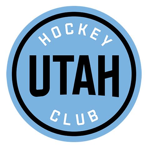
Jazz owner Ryan Smith assumed ownership of the now defunct Arizona Coyotes franchise and the team relocated to Salt Lake City to play their inaugural season in the NHL, in 2024-25, as a new expansion club with a temporary uniform design and colors. A full-time identity and logo are still forthcoming.
Utah unveiled their part-time logo as a basic, circular puck-like disc framing the state name and straightforward, generic moniker in mountain blue, rock black, and salt white.
- 10 Views
Graphical characteristics:
Asymmetric, Closed shape, Colorful, Contains curved lines, Has no crossing lines.
Category: Sports symbols.
Utah Hockey Club Logo is part of the National Hockey League group.
More symbols in National Hockey League:
The National Hockey League (NHL; French: Ligue nationale de hockey—LNH) is a professional ice hockey league composed of 30 member clubs: 23 in the United States and 7 in Canada. Headquartered in New … read more »
More symbols in Sports symbols:
Symbols team logos and popular crests used in all kind of sports. read more »
Citation
Use the citation below to add this symbol to your bibliography:
Style:MLAChicagoAPA
"Utah Hockey Club Logo." Symbols.com. STANDS4 LLC, 2025. Web. 3 Mar. 2025. <https://www.symbols.com/symbol/utah-hockey-club-logo>.









Have a discussion about Utah Hockey Club Logo with the community:
Report Comment
We're doing our best to make sure our content is useful, accurate and safe.
If by any chance you spot an inappropriate comment while navigating through our website please use this form to let us know, and we'll take care of it shortly.
Attachment
You need to be logged in to favorite.
Log In