What's the meaning of the Arizona Coyotes Logo »
Arizona Coyotes Logo
This page is about the meaning, origin and characteristic of the symbol, emblem, seal, sign, logo or flag: Arizona Coyotes Logo.
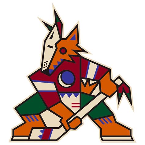
The Arizona Coyotes are a professional ice hockey team based in the Phoenix metropolitan area of Arizona. They are members of the Pacific Division of the Western Conference of the National Hockey League (NHL).
Since December 2003, the Coyotes have played their home games at Gila River Arena after having spent 7½ seasons at America West Arena (now Talking Stick Resort Arena) in downtown Phoenix. On June 10, 2015, the Glendale City Council voted to end their lease agreement with the Coyotes at Gila River Arena. On July 23, 2015, it was announced that the Coyotes and the Glendale City Council had agreed on a resolution,and the next day it was announced that the Coyotes would stay in Glendale for the next two seasons initially.
The Coyotes were founded on December 27, 1971, as the Winnipeg Jets of the World Hockey Association (WHA). After the WHA had ceased operations, they were one of four franchises absorbed into the National Hockey League and then granted membership on June 22, 1979.
Upon their arrival in Phoenix in 1996, the team adopted a look with a strong Southwestern flavor. The primary logo was a stylized hockey stick-wielding coyote in a kachina-inspired style. The jerseys featured pointed green shoulders with brick red trim over a white (home) or black (road) body, and non-traditional striping patterns. These uniforms remained in place until 2003. A third jersey, primarily green with a nighttime desert landscape wrapped around the bottom and the cuffs of the sleeves, was introduced in 1998, and retired in 2003 when the team redesigned the uniforms.
As the NHL switched home and road jerseys beginning in the 2003–04 season, and coinciding with the team's move from America West Arena to the newly completed Glendale Arena, the Coyotes redesigned their look completely, adopting the current howling coyote head logo, while dropping several colors from the team's palette. Sedona red and white became the primary colors, with desert sand and black remaining as logo trim colors. A variation of these colors was later used for the Major League Baseball team Arizona Diamondbacks. The uniform's simplified two-color scheme with three stripes on each sleeve and the tail bears some resemblance to later versions of the Montreal Maroons jerseys. The team also changed its shoulder patch, taking the form of the outline of the state of Arizona, with an homage to the state flag and the abbreviation "PHX". This logo was worn only on the right shoulder leaving the left shoulder bare.
The Coyotes updated their jerseys for the 2007–08 season, along with all NHL teams, as part of the switchover to Rbk Edge jerseys. The changes made were adding an NHL crest just below the neck opening, removing the stripes that were previously just above the lower hem, and moving the "PHX" patch from the right to the left shoulder. The white jersey also gained red shoulder coloring and laces at the collar. The three-stripe pattern is applied to the side of the pants.
The Coyotes also added a third jersey for the 2008–09 season. It is primarily black and features a new alternate coyote logo on the front, with the primary logo (coyote head) patch on the right shoulder, and the "Official Seal" on the left.[36] Since white does not appear on the alternate, solid red pant shells are worn with this jersey.
Before the 2014-15 season, it was announced that the Coyotes third jersey would no longer be used. The patch on the home and away jerseys that used to read "PHX" would also be changed to read "AZ" to comply with the team's rebranded name.
On June 26, 2015, the Coyotes introduced updated jerseys. As described by an official press release, "The body of the Coyotes home and away jerseys remains unchanged but the new jerseys feature an original sleeve stripe designed to connect with Arizona's distinctive striated landscape. These bold sleeves, along with a striking black pant, will be worn both at home in Glendale and on the road. The new red jersey shoulder patch features a coyote's paw "A" mark, an icon built for Arizona's hockey fans; while the white jersey shoulder will carry an updated "AZ" mark, connecting back to the new word mark. Finally, a uniquely Southwestern pattern in the jersey's neckline connects the Coyotes to the legacy of Arizona. This updated uniform features Reebok's latest technological innovations and represents an industry leading commitment to the best for the athlete.
The Coyotes quietly brought back the 1996–2003 Kachina logo as the primary, and later revealed a white road version of the Kachina uniforms while keeping the previous "howling coyote" home uniform as an alternate for the 2022–23 season. They once again wore their 1998–2003 Kachina head alternates as its "Reverse Retro" uniform, but with sienna as the base color. Also during that season, a new alternate uniform was released, returning to the simplified brick red and sand color scheme from 2003 to 2015 but with kachina patterns at the bottom and on the sleeves.
- 823 Views
Graphical characteristics:
Asymmetric, Closed shape, Colorful, Contains curved lines, Has no crossing lines.
Category: Sports symbols.
Arizona Coyotes Logo is part of the National Hockey League group.

More symbols in National Hockey League:
The National Hockey League (NHL; French: Ligue nationale de hockey—LNH) is a professional ice hockey league composed of 30 member clubs: 23 in the United States and 7 in Canada. Headquartered in New … read more »
More symbols in Sports symbols:
Symbols team logos and popular crests used in all kind of sports. read more »
Citation
Use the citation below to add this symbol to your bibliography:
Style:MLAChicagoAPA
"Arizona Coyotes Logo." Symbols.com. STANDS4 LLC, 2025. Web. 21 Feb. 2025. <https://www.symbols.com/symbol/arizona-coyotes-logo>.










Have a discussion about Arizona Coyotes Logo with the community:
Report Comment
We're doing our best to make sure our content is useful, accurate and safe.
If by any chance you spot an inappropriate comment while navigating through our website please use this form to let us know, and we'll take care of it shortly.
Attachment
You need to be logged in to favorite.
Log In