What's the meaning of the Minnesota Timberwolves Logo »
Minnesota Timberwolves Logo
This page is about the meaning, origin and characteristic of the symbol, emblem, seal, sign, logo or flag: Minnesota Timberwolves Logo.
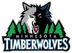
In their inaugural season in 1989, the Timberwolves (or "Wolves" as it said on their jerseys) debuted blue road uniforms with green lettering and numbers with white. Their home uniforms featured blue lettering and numbers with green outlining. The creation of both uniforms was led by head designer, Brian Mulligan. There was going to be a green alternate jersey with blue lettering to go with the uniforms, but the idea was dropped. It would've followed a similar move the Dallas Mavericks took when they switched back to blue in the early 1990s, opting the Wolves a chance to use green for a jersey color instead.
After drafting Kevin Garnett, the Timberwolves design team, under guidance from Brian Mulligan, changed their uniforms yet again in 1996.
This time, the team added black and grey to the mix, and changing to a darker shade of blue.
The front of the jerseys then said the team's full name "Timberwolves" in a different font. For the 1997–98 season, a black alternate uniform was introduced. Those uniforms were used until the 2007–08 season.[76] The uniforms changed again in the 2008 off-season, this time with the road jerseys reading "Minnesota" and the home jerseys reading "Wolves", similar to that of the team's early years. Both uniforms had green, black, grey and blue on the pits and sides of the shorts. The Timberwolves unveiled modified uniforms on August 16, 2010. The new uniforms eliminated the green from the collar, jersey and shorts, and the team also adjusted its number font again. On November 23, 2010, the Timberwolves unveiled a black alternate uniform.
On November 27, 2013, the team changed their black road alternate jersey to a short sleeved jersey. The change came about due to the NBA's introduction of sleeved jerseys.
- 661 Views
Graphical characteristics:
Asymmetric, Closed shape, Colorful, Contains curved lines, Has no crossing lines.
Category: Sports symbols.
Minnesota Timberwolves Logo is part of the National Basketball Association Logos group.
More symbols in National Basketball Association Logos:
The National Basketball Association (NBA) was established on June 6, 1946 and originally known as the Basketball Association of American (BAA). Of the original 11 franchises in that inaugural season … read more »
More symbols in Sports symbols:
Symbols team logos and popular crests used in all kind of sports. read more »
Citation
Use the citation below to add this symbol to your bibliography:
Style:MLAChicagoAPA
"Minnesota Timberwolves Logo." Symbols.com. STANDS4 LLC, 2025. Web. 22 Feb. 2025. <https://www.symbols.com/symbol/minnesota-timberwolves-logo>.





Have a discussion about Minnesota Timberwolves Logo with the community:
Report Comment
We're doing our best to make sure our content is useful, accurate and safe.
If by any chance you spot an inappropriate comment while navigating through our website please use this form to let us know, and we'll take care of it shortly.
Attachment
You need to be logged in to favorite.
Log In