What's the meaning of the Charlotte Hornets Logo »
Charlotte Hornets Logo
This page is about the meaning, origin and characteristic of the symbol, emblem, seal, sign, logo or flag: Charlotte Hornets Logo.
When the Hornets were first introduced, the logo was of a teal and purple scowl-faced anthropomorphic hornet wearing white shoes and gloves dribbling an orange basketball. The words 'Charlotte Hornets' were in teal and curved across the top and bottom of the logo. An alternate logo, used only for the 1988–89 season, featured a large teal letter 'C', with 'Charlotte' in black letters curved upwards underneath. Inside the 'C' was a smaller white letter 'H' outlined in teal, with a black colored hornet holding a basketball from birds-eye view placed in the center. The 'H' portion of the logo remained on the warm-ups and wasteband of the jerseys until the 1991–92 season.
The Bobcats primary logo from 2004 to 2013 consisted of a snarling orange bobcat heat facing to the right with the indented name 'Bobcats' above it in silver on a blue background, with 'Charlotte' (also indented) appearing above it in the same blue color. A change to a less vibrant orange and blue, while retaining the same look, was made in 2007. Further color changes in 2013 made the bobcat gray, extended the blue background up to the 'Charlotte' name, which changed from blue to gray. A Carolina blue outline around the entire logo was also added. In 2007 the Bobcats unveiled a secondary logo, consisting of a snarling bobcat head facing forward with one side shaded orange, and the other blue. A silver basketball was placed behind the right of the head, all encased in an orange-blue-gray circle. During the 2013 rebranding, the colors were changed, with gray and Carolina blue replacing orange on the head and circle outline, respectively, and the basketball changing to orange. This logo would become prominent in the team's marketing and be featured at center court from 2007–08 until 2013–14.
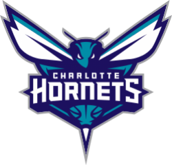
Charlotte's second Hornets logo features a teal and purple forward-facing hornet with the words 'Charlotte Hornets' on its torso. Wings sprout up above the head on both left and right, with teal and purple details. The hornet's stinger is prominently featured; a basketball pattern is above the stinger. Gray fully outlines the logo. Among the team's different secondary logos includes a hornet facing to the side, its teal and purple body arched in a 'C' shape representing the city of Charlotte, and a modified version of the Hornets original logo (sans the basketball) as the official mascot logo.
- 1,069 Views
Graphical characteristics:
Asymmetric, Closed shape, Colorful, Contains curved lines, Has no crossing lines.
Category: Sports symbols.
Charlotte Hornets Logo is part of the National Basketball Association Logos group.
More symbols in National Basketball Association Logos:
The National Basketball Association (NBA) was established on June 6, 1946 and originally known as the Basketball Association of American (BAA). Of the original 11 franchises in that inaugural season … read more »
More symbols in Sports symbols:
Symbols team logos and popular crests used in all kind of sports. read more »
Citation
Use the citation below to add this symbol to your bibliography:
Style:MLAChicagoAPA
"Charlotte Hornets Logo." Symbols.com. STANDS4 LLC, 2025. Web. 21 Jan. 2025. <https://www.symbols.com/symbol/charlotte-hornets-logo>.









Have a discussion about Charlotte Hornets Logo with the community:
Report Comment
We're doing our best to make sure our content is useful, accurate and safe.
If by any chance you spot an inappropriate comment while navigating through our website please use this form to let us know, and we'll take care of it shortly.
Attachment
You need to be logged in to favorite.
Log In