What's the meaning of the Los Angeles Angels of Anaheim Logo »
Los Angeles Angels of Anaheim Logo
This page is about the meaning, origin and characteristic of the symbol, emblem, seal, sign, logo or flag: Los Angeles Angels of Anaheim Logo.
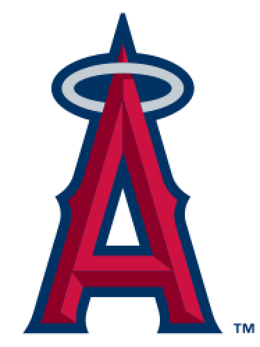
The Los Angeles Angels of Anaheim have used ten different logos and three different color combinations throughout their history. Their first two logos depict a baseball with wings and a halo over a baseball diamond with the letters "L" and "A" over it in different styles. The original team colors were the predominantly blue with a red trim. This color scheme would be in effect for most of the franchise's history lasting from 1961 to 1996.
In 1966, after the club's move to Anaheim, the team name changed from the "Los Angeles Angels" to the "California Angels", along with the name change, the logo changed as well. During the 31 years of being known as the "California Angels", the team kept the previous color scheme, however, their logo did change six times during this period. The first logo under this name was very similar to the previous "LA" logo, the only difference was instead of an interlocking "LA", there was an interlocking "CA." Directly after this from 1971 to 1985, the Angels
It was in 1965, while the stadium was being finished, that Bud Furillo (of the Herald Examiner) coined its nickname, "the Big A" after the tall letter A that once stood beyond left-center field and served as the arena's primary scoreboard (it was later relocated to a section of the parking lot, south-east of the stadium).
In 1986, the Angels adopted the "big A" on top of a baseball as their new logo, with the shadow of California in the background. After the "big A" was done in 1992, the Angels returned to their roots and re-adopted the interlocking "CA" logo with some differences. The Angels used this logo from 1993 to 1996, during that time, the "CA" was either on top of a blue circle or with nothing else.
After the renovations of then-Anaheim Stadium and the takeover by the Walt Disney Company, the Angels changed their name to the "Anaheim Angels" along with changing the logo and color scheme. The first logo under Disney removed the halo and had a rather cartoon-like "ANGELS" script with a wing on the "A" over a periwinkle plate and crossed bats. With this change, the Angels' color scheme changed to dark blue and periwinkle. After a run with the "winged" logo from 1997 to 2001, Disney changed the Angels's logo back to a "Big A" with a silver logo over a dark blue baseball diamond. With this logo change, the colors changed to the team's current color scheme: predominantly red with some dark blue and white.
When the team's name changed from the "Anaheim Angels" to the "Los Angeles Angels of Anaheim", the logo changed only slightly, the name "ANAHEIM ANGELS" and the blue baseball diamond were removed leaving only the "Big A."
For the 2011 season, as part of the 50th anniversary of the Angels franchise, the halo on the 'Big A' logo temporarily changed colors from silver to old gold, paying tribute to the Angels logos of the past. The uniforms also reflected the change to the gold halo for this season. During the 50th Anniversary season the players have worn throwback jerseys at each Friday home game reflecting all the different logos and uniforms previously worn by players. Also Angels alumni from past season during the 50th year throw out the first Angels pitch at every home game.
A new patch was added on the uniforms before the 2012 season, featuring a red circle encircling the words "Angels Baseball" and the club logo inside and flanking the year 1961 in the middle, which was the year the Angels franchise was established.
- 1,271 Views
Graphical characteristics:
Asymmetric, Closed shape, Colorful, Contains both straight and curved lines, Has crossing lines.
Category: Sports symbols.
Los Angeles Angels of Anaheim Logo is part of the Major League Baseball group.

More symbols in Major League Baseball:
Major League Baseball (MLB) is a professional baseball organization, the oldest of the four major professional sports leagues in the United States and Canada. A total of 30 teams now play in the Amer… read more »
More symbols in Sports symbols:
Symbols team logos and popular crests used in all kind of sports. read more »
Citation
Use the citation below to add this symbol to your bibliography:
Style:MLAChicagoAPA
"Los Angeles Angels of Anaheim Logo." Symbols.com. STANDS4 LLC, 2025. Web. 26 Feb. 2025. <https://www.symbols.com/symbol/los-angeles-angels-of-anaheim-logo>.








Have a discussion about Los Angeles Angels of Anaheim Logo with the community:
Report Comment
We're doing our best to make sure our content is useful, accurate and safe.
If by any chance you spot an inappropriate comment while navigating through our website please use this form to let us know, and we'll take care of it shortly.
Attachment
You need to be logged in to favorite.
Log In