What's the meaning of the Chicago White Sox Logo »
Chicago White Sox Logo
This page is about the meaning, origin and characteristic of the symbol, emblem, seal, sign, logo or flag: Chicago White Sox Logo.

Over the years the White Sox have become noted for many of their uniform innovations and changes. In 1960, the White Sox became the first team in the major sports to put players' last names on jerseys.
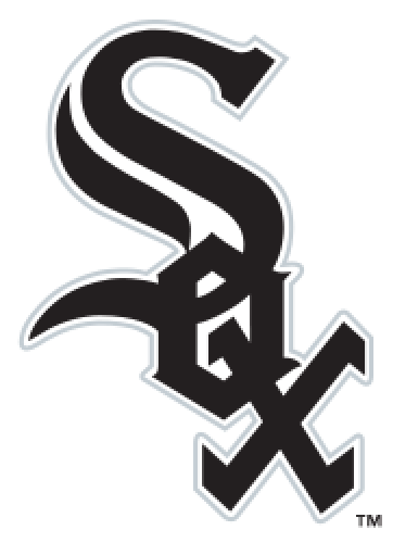
In 1912 the White Sox debuted one of the most enduring and famous logos in baseball—a large "S" in a Roman-style font, with a small "O" inside the top loop of the "S" and a small "X" inside the bottom loop. This is the logo associated with the 1917 World Series championship team and the 1919 Black Sox. With a couple of brief interruptions, the dark-blue logo with the large "S" lasted through 1938 (but continued in a modified block style into the 1940s). Through the 1940s, the White Sox team colors were primarily navy blue trimmed with red.
The White Sox logo in the 1950s and 1960s (actually beginning in the 1949 season) was the word "SOX" in an Old English font, diagonally arranged, with the "S" larger than the other two letters. From 1949 through 1963, the primary color was black (tri
In 1976 the team's uniforms changed again. The team's primary color changed back from red to navy. The team based their uniforms on a style worn in the early days of the franchise, with white jerseys worn at home, blue on the road. The team brought back white socks for the last time in team history. The socks featured a different stripe pattern every year. The team also had the option to wear blue or white pants with either jersey. Additionally the teams "SOX" logo was changed to a modern-looking "SOX" in a bold font, with 'CHICAGO' written across the jersey. Finally, the team's logo featured a silhouette of a batter over the words "SOX".
The new uniforms also featured collars and were designed to be worn untucked — both unprecedented. Yet by far the most unusual wrinkle was the option to wear shorts, which the White Sox did for the first game of a doubleheader against the Kansas City Royals in 1976. The Hollywood Stars of the Pacific Coast League had previously tried the same concept, it was also poorly received. Apart from aesthetic issues, as a practical matter shorts are not conducive to sliding, due to the likelihood of significant abrasions.
Upon taking over the team in 1980 new owners Eddie Einhorn and Jerry Reinsdorf announced a contest where fans were invited to create new uniforms for the White Sox. The winning entry was submitted by a fan where the word "SOX" was written across the front of the jersey, in the same font as a cap, inside of a large blue stripe trimmed with red. The red and blue stripes were also on the sleeves, and the road jerseys were gray to the home whites. In those jerseys the White Sox won 99 games and the AL West championship in 1983, the best record in the majors.
After five years those uniforms were retired and replaced with a more basic uniform which had "White Sox" written across the front in script, with "Chicago" on the front of the road jersey. The cap logo was also changed to a cursive "C", although the batter logo was retained for several years.
For a mid-season 1990 game at Comiskey Park the White Sox appeared once in a uniform based on that of the 1917 White Sox.
The White Sox then switched their regular uniform style once more. In September, for the final series at Old Comiskey Park, the old English "SOX" logo (a slightly simplified version of the 1949–63 logo) was restored, and the new uniform also had the black pinstripes restored. The team's primary color changed back to black, this time with silver trim. The team also introduced a new sock logo—a white silhouette of a sock centered inside a white outline of a baseball diamond—which appeared as a sleeve patch on the away and alternate uniforms until 2011 when the patch was switched with the primary logo on the away uniform. With minor modifications (i.e., occasionally wearing vests, black game jerseys) the White Sox have used this style ever since.
During the 2012 and 2013 seasons, the White Sox wore their throwback uniforms at home every Sunday, starting with the 1972 red-pinstriped throwback jerseys worn during the 2012 season, followed by the 1981–86 uniforms the next season. In the 2014 season, the "Winning Ugly" throwbacks were promoted to full-time alternate status, and is now worn at home on select dates. In one game during the 2014 season, the White Sox paired their throwbacks with a cap featuring the batter logo instead of the wordmark "SOX"; this is currently their batting practice cap prior to games in the throwback uniforms.
- 2,225 Views
Graphical characteristics:
Asymmetric, Closed shape, Monochrome, Contains curved lines, Has crossing lines.
Category: Sports symbols.
Chicago White Sox Logo is part of the Major League Baseball group.

More symbols in Major League Baseball:
Major League Baseball (MLB) is a professional baseball organization, the oldest of the four major professional sports leagues in the United States and Canada. A total of 30 teams now play in the Amer… read more »
More symbols in Sports symbols:
Symbols team logos and popular crests used in all kind of sports. read more »
Citation
Use the citation below to add this symbol to your bibliography:
Style:MLAChicagoAPA
"Chicago White Sox Logo." Symbols.com. STANDS4 LLC, 2025. Web. 26 Feb. 2025. <https://www.symbols.com/symbol/chicago-white-sox-logo>.





Have a discussion about Chicago White Sox Logo with the community:
Report Comment
We're doing our best to make sure our content is useful, accurate and safe.
If by any chance you spot an inappropriate comment while navigating through our website please use this form to let us know, and we'll take care of it shortly.
Attachment
You need to be logged in to favorite.
Log In