What's the meaning of the Chicago Blackhawks logo »
Chicago Blackhawks logo
This page is about the meaning, origin and characteristic of the symbol, emblem, seal, sign, logo or flag: Chicago Blackhawks logo.
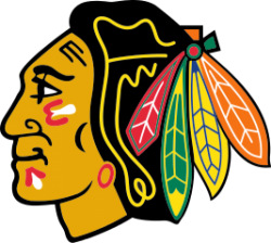
McLaughlin's wife, Irene Castle, designed the original version of the team's logo, which featured a crudely-drawn black and white Native head in a circle.This design went through several significant changes between 1926 and 1955. During this period, seven distinct versions of the primary logo were worn on the team's uniforms. At the beginning of the 1955–56 season, the outer circle was removed and the head began to resemble the team's current primary logo. This crest and uniform went through subtle changes until the 1964–65 season; the basic logo and jersey design have remained constant ever since. In 2008, The Hockey News' staff voted the team's main logo to be the best in the NHL. In 2010, sports columnist Damien Cox called on the franchise to retire the "racially insensitive" logo, saying that, "Clearly, no right-thinking person would name a team after an aboriginal figure these days any more than they would use Muslims or Africans or Chinese or any ethnic group to depict a specific
The Blackhawks have worked with the American Indian Center to help educate their community and fan base by sharing Native American culture and history. Scott Sypolt, executive counsel for the American Indian Center, commented on the logo and name controversy: Joe Podlasek, the executive director of the American Indian Center of Chicago, commented on their relationship, stating, "[The Hawks] are far and away ahead of everyone else in forward-thinking. What they have done is engaged the community. In the other cities (organizations) want nothing to do with native people but yet they’re trying to say they respect us."However, this stance is markedly different from the one taken by the American Indian Center up until recent years. In 2010, Joe Podlasek stated that, "The stance is very clear. We want the Chicago Blackhawks logo to change. For us, that's one of our grandfathers. Would you do that with your grandfather's picture? Take it and throw it on a rug? Walk on it and dance on it?" John Blackhawk, Chairman of the Winnebago Tribe of Nebraska, has suggested that the change in position may be tied to contributions the team has recently begun making to the center: "We all do contributions, but we don't do it for the sake of wanting to be forgiven for something we've done that's offensive."
- 767 Views
Graphical characteristics:
Asymmetric, Closed shape, Colorful, Contains curved lines, Has crossing lines.
Category: Sports symbols.
Chicago Blackhawks logo is part of the National Hockey League group.
More symbols in National Hockey League:
The National Hockey League (NHL; French: Ligue nationale de hockey—LNH) is a professional ice hockey league composed of 30 member clubs: 23 in the United States and 7 in Canada. Headquartered in New … read more »
More symbols in Sports symbols:
Symbols team logos and popular crests used in all kind of sports. read more »
Citation
Use the citation below to add this symbol to your bibliography:
Style:MLAChicagoAPA
"Chicago Blackhawks logo." Symbols.com. STANDS4 LLC, 2025. Web. 4 Mar. 2025. <https://www.symbols.com/symbol/chicago-blackhawks-logo>.






Have a discussion about Chicago Blackhawks logo with the community:
Report Comment
We're doing our best to make sure our content is useful, accurate and safe.
If by any chance you spot an inappropriate comment while navigating through our website please use this form to let us know, and we'll take care of it shortly.
Attachment
You need to be logged in to favorite.
Log In