What's the meaning of the Tampa Bay Buccaneers Logo »
Tampa Bay Buccaneers Logo
This page is about the meaning, origin and characteristic of the symbol, emblem, seal, sign, logo or flag: Tampa Bay Buccaneers Logo.
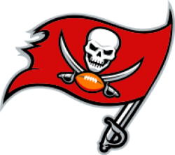
When the team began play in 1976, Culverhouse initially picked team colors of red, green, orange and white. However, the shade of green was too close to that used by the Miami Dolphins. A medium shade of "Florida Orange" was substituted for green. Home uniforms included orange jerseys with white numerals outlined in red—the now-infamous "Creamsicle" uniforms. Road white jerseys originally had orange numerals outlined in red, but these colors were reversed for year two and beyond. The color swap provided better visibility, especially for television coverage purposes.
Long-time Tampa Tribune cartoonist and Ye Mystic Krewe of Gasparilla member Lamar Sparkman designed the first team logo. Faced with the challenge of designing a logo that did not closely resemble that of the other "pirates" in the league, the Oakland Raiders, Sparkman came up with a pirate in a plumed slouch hat, with a large hoop earring, clutching a dagger in his teeth. The pirate appeared to be winking. He came to be kn
However, there was controversy over where the cartoonist received inspiration for his Buccaneer. Beloit College, located in Beloit, Wisconsin, received a notice from the Tampa Bay Buccaneers of the college's illegitimate use of their mascot. Beloit College's buccaneer is the mirror image of the Tampa Bay buccaneer, with the creamsicle colors replaced with Beloit's school colors. Athletic Director Ed DeGeorge said Beloit's Buccaneers have used the logo since the early 1980s, when he chose it from a book while ordering decals for the football team's helmets. The NFL's Buccaneers joined the league in 1976.
However, the Buccaneers withdrew their claim against Beloit College because of the independent decision to redesign the logo.
In 1992, the Buccaneers introduced orange pants to be worn with the white jerseys. Prior to the team's season finale in 1995 against the Lions, lame-duck coach Sam Wyche suggested that the Buccaneers wear the orange pants with their orange jerseys. The idea was vetoed by, among others, Pro Bowl linebacker Hardy Nickerson.
For the 1993 season, following Culverhouse's death, the Buccaneers added a commemorative patch to the right sleeve of their orange away uniforms, which read "Mr C" in cursive script.
- 1,416 Views
Graphical characteristics:
Asymmetric, Closed shape, Colorful, Contains curved lines, Has crossing lines.
Category: Sports symbols.
Tampa Bay Buccaneers Logo is part of the National Football League group.

More symbols in National Football League:
The National Football League (NFL) is a professional American football league consisting of 32 teams, divided equally between the National Football Conference (NFC) and the American Football Conferen… read more »
More symbols in Sports symbols:
Symbols team logos and popular crests used in all kind of sports. read more »
Citation
Use the citation below to add this symbol to your bibliography:
Style:MLAChicagoAPA
"Tampa Bay Buccaneers Logo." Symbols.com. STANDS4 LLC, 2025. Web. 22 Feb. 2025. <https://www.symbols.com/symbol/tampa-bay-buccaneers-logo>.










Have a discussion about Tampa Bay Buccaneers Logo with the community:
Report Comment
We're doing our best to make sure our content is useful, accurate and safe.
If by any chance you spot an inappropriate comment while navigating through our website please use this form to let us know, and we'll take care of it shortly.
Attachment
You need to be logged in to favorite.
Log In