What's the meaning of the Pittsburgh Steelers Logo »
Pittsburgh Steelers Logo
This page is about the meaning, origin and characteristic of the symbol, emblem, seal, sign, logo or flag: Pittsburgh Steelers Logo.
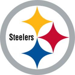
The Steelers have used black and gold as their colors since the club's inception, the lone exception being the 1943 season when they merged with the Philadelphia Eagles and formed the "Steagles"; the team's colors at that time were green and white as a result of wearing Eagles uniforms. Originally, the team wore solid gold-colored helmets and black jerseys. The Steelers' black and gold colors are now shared by all major professional teams in the city, including the Pittsburgh Pirates in baseball and the Pittsburgh Penguins in ice hockey, and also the Pittsburgh Power of the reformed Arena Football League, and the Pittsburgh Passion of the Independent Women's Football League. The shade of gold differs slightly among teams: the Penguins currently use "Vegas Gold", a color similar to metallic gold, and the Pirates' gold is a darker mustard yellow-gold, while the Steelers "gold" is more of a bright canary yellow. Black and gold are also the colors of the city's official flag.
The Steelers logo was introduced in 1962 and is based on the "Steelmark", originally designed by Pittsburgh's U.S. Steel and now owned by the American Iron and Steel Institute (AISI). In fact, it was Cleveland-based Republic Steel that suggested the Steelers adopt the industry logo. It consists of the word "Steelers" surrounded by three astroids (hypocycloids of four cusps). The original meanings behind the astroids were, "Steel lightens your work, brightens your leisure, and widens your world." Later, the colors came to represent the ingredients used in the steel-making process: yellow for coal, red for iron ore, and blue for scrap steel. While the formal Steelmark logo contains only the word "Steel", the team was given permission to add "ers" in 1963 after a petition to AISI.
The Steelers are the only NFL team that puts its logo on only one side of the helmet (the right side). Longtime field and equipment manager Jack Hart was instructed to do this by Art Rooney as a test to see how the logo appeared on the gold helmets; however, its popularity led the team to leave it that way permanently.
A year after introducing the logo, they switched to black helmets to make it stand out more.
The Steelers, along with the New York Giants, are one of only two teams in the National Football League to have the players' uniform numbers on both the front and back of the helmets.
The current uniform designs were introduced in 1968. The design consists of gold pants and either black jerseys or white jerseys, except for the 1970 and 1971 seasons when the Steelers wore white pants with their white jerseys. In 1997, the team switched to rounded numbers on the jersey to match the number font (Futura Condensed) on the helmets, and a Steelers logo was added to the left side of the jersey.
The current third uniform, consisting of a black jersey with gold lettering, white pants with black and gold stripes, and a gold helmet were first used during the Steelers' 75th anniversary season in 2007. They were meant to evoke the memory of the 1963–1964 era uniforms. The uniforms were so popular among fans that the Steeler organization decided to keep them and use them as a third option during home games only.
In 2008–2009, the Steelers became the first team in NFL history to defeat an opponent three times in a single season using three different uniforms.[citation needed] They defeated the Baltimore Ravens in Pittsburgh in Week 4 in their third jerseys, again Week 15 in Baltimore in their road whites, and a final time in the AFC Championship in Pittsburgh in their home black jerseys.
In 1978, the team owners were approached by then-Iowa Hawkeyes Head Coach Hayden Fry about designing his fading college team's uniforms in the image of the Steelers. Three days later, the owners sent Fry the reproduction jerseys (home and away versions) of then quarterback Terry Bradshaw. Today, the Hawkeyes still retain the 1978 Steelers uniforms as their home, and away colors.
- 2,340 Views
Graphical characteristics:
Asymmetric, Closed shape, Colorful, Contains curved lines, Has no crossing lines.
Category: Sports symbols.
Pittsburgh Steelers Logo is part of the National Football League group.

More symbols in National Football League:
The National Football League (NFL) is a professional American football league consisting of 32 teams, divided equally between the National Football Conference (NFC) and the American Football Conferen… read more »
More symbols in Sports symbols:
Symbols team logos and popular crests used in all kind of sports. read more »
Citation
Use the citation below to add this symbol to your bibliography:
Style:MLAChicagoAPA
"Pittsburgh Steelers Logo." Symbols.com. STANDS4 LLC, 2025. Web. 22 Jan. 2025. <https://www.symbols.com/symbol/pittsburgh-steelers-logo>.





Have a discussion about Pittsburgh Steelers Logo with the community:
Report Comment
We're doing our best to make sure our content is useful, accurate and safe.
If by any chance you spot an inappropriate comment while navigating through our website please use this form to let us know, and we'll take care of it shortly.
Attachment
You need to be logged in to favorite.
Log In