What's the meaning of the OAuth logo »
OAuth logo
This page is about the meaning, origin and characteristic of the symbol, emblem, seal, sign, logo or flag: OAuth logo.

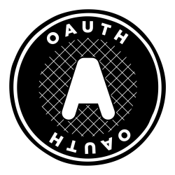
The OAuth logo, designed by Chris Messina.
The logo is designed to meet the following criteria:
a robust and bold look;
something that looks polished;
something that isn't overly concerned with locks and keys or "security metaphors";
and something that is easily identifiable and unique and doesn't blend in with other Web 2.0 logos;
As well, unlike the OpenID logo, the OAuth logo is unlikely to be seen by regular users and is primarily to identify the community and group.
The typeface is Gotham Black.
- 1,039 Views
Graphical characteristics:
Asymmetric, Closed shape, Colorful, Contains both straight and curved lines, Has no crossing lines.
Citation
Use the citation below to add this symbol to your bibliography:
Style:MLAChicagoAPA
"OAuth logo." Symbols.com. STANDS4 LLC, 2025. Web. 3 Mar. 2025. <https://www.symbols.com/symbol/oauth-logo>.


Have a discussion about OAuth logo with the community:
Report Comment
We're doing our best to make sure our content is useful, accurate and safe.
If by any chance you spot an inappropriate comment while navigating through our website please use this form to let us know, and we'll take care of it shortly.
Attachment
You need to be logged in to favorite.
Log In