What's the meaning of the New York Jets Logo »
New York Jets Logo
This page is about the meaning, origin and characteristic of the symbol, emblem, seal, sign, logo or flag: New York Jets Logo.
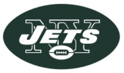
The Jets' colors are hunter green and white. The team's current uniform and primary logo, in use since 1998, are modernized versions of the design used from 1965-77. The helmet is white with two parallel green stripes down the center, and a green facemask. The primary logo, which appears on each side of the helmet and on the jersey front by the player's left shoulder, is a green oval with the word "JETS" in thick white sans-serif italics over "NY" in outline serif lettering, and a white miniature football graphic at bottom center. The jerseys have standard one-color block numerals and serif lettering, alternating stripes on the shoulders, and opposite-colored sleeves and TV numerals. The team uses both white pants with two parallel green stripes from hip to knee on each side, and green pants with white stripes.
The team's original uniforms, as the Titans of New York in 1960, were navy blue with old gold numerals, gold pants with two parallel blue stripes on each side, and navy blue helmets with a single gold stripe down the center and no logo decals. The white jerseys had navy blue numerals. In 1961 the Titans added UCLA-style shoulder stripes (gold and white on the blue jerseys, gold and navy blue on the white jerseys), changed the pants striping to a blue stripe flanked by white stripes, and employed a somewhat brighter shade of gold.
When the Titans became the Jets in 1963, navy and gold were abandoned in favor of kelly green and white. The jerseys had thick opposite-colored stripes on the shoulders, sleeves and cuffs, with the TV numerals set within the broader sleeve stripe. The pants were white with two parallel green stripes on each side. The new helmets were white with a single green stripe down the center; the logo on each side was a silhouette of a jet airplane in green, with the word "JETS" in thick white sans-serif italics along the fuselage. In 1964, the single green stripe became two parallel stripes, and the jet-plane decal was replaced with a white football shape outlined in green, with the word "JETS" in thick green sans-serif italics in front of "NY" in green outline serif lettering, and a miniature football at bottom center. The decals were difficult to see from a distance (or on television), so the colors were reversed in 1965.
- 774 Views
Graphical characteristics:
Asymmetric, Closed shape, Colorful, Contains curved lines, Has no crossing lines.
Category: Sports symbols.
New York Jets Logo is part of the National Football League group.

More symbols in National Football League:
The National Football League (NFL) is a professional American football league consisting of 32 teams, divided equally between the National Football Conference (NFC) and the American Football Conferen… read more »
More symbols in Sports symbols:
Symbols team logos and popular crests used in all kind of sports. read more »
Citation
Use the citation below to add this symbol to your bibliography:
Style:MLAChicagoAPA
"New York Jets Logo." Symbols.com. STANDS4 LLC, 2025. Web. 24 Jan. 2025. <https://www.symbols.com/symbol/new-york-jets-logo>.




Have a discussion about New York Jets Logo with the community:
Report Comment
We're doing our best to make sure our content is useful, accurate and safe.
If by any chance you spot an inappropriate comment while navigating through our website please use this form to let us know, and we'll take care of it shortly.
Attachment
You need to be logged in to favorite.
Log In