What's the meaning of the Jacksonville Jaguars Logo »
Jacksonville Jaguars Logo
This page is about the meaning, origin and characteristic of the symbol, emblem, seal, sign, logo or flag: Jacksonville Jaguars Logo.
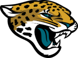
The day after the NFL awarded the expansion team to Jacksonville, a triumphant Wayne Weaver held up the Jaguars' proposed silver helmet and teal jersey at the NFL owners' meeting in Chicago. The team's colors were to be teal, gold, and silver with black accents. However, this jersey and helmet design, with a gold leaping jaguar, created controversy. Ford Motor Company, then-parent of the automaker Jaguar, believed that the Jaguars' logo bore too much resemblance to the automaker's logo. Though no lawsuit was brought to trial, lawyers from the team and the automaker negotiated an ultimately amicable agreement whereby Jaguar would be named the official car of the Jaguars, and the Jaguars would redesign their uniforms.
The new logo was a snarling jaguar head with a teal tongue, which Weaver said was his wife's touch. He also claimed that the teal tongue came from "feeding Panthers to our Jaguars" — an obvious jab at their expansion brethren. During the Jaguars' first ever preseason game teal-colored candies were handed out to all the fans who attended, turning their tongues a teal color just like on the logo. Additionally, raspberry lollipops were handed out by the "Candy Man" in section 142 to also turn the home fans' tongues teal.[citation needed]
In 2009, Weaver announced that he wanted to 'clean up' the team's image. This meant the elimination of the full-body crawling Jaguar logo, the clawing Jaguar, and the two previous wordmarks which bent the text around these logos.
In February 2013, Jaguars owner Shahid Khan, who had acquired the team in late 2011, introduced a new brand identity for the team that included a new logo, wordmark, and secondary logo. The new Jaguar head logo was intended to be "fiercer" and more realistic.
The secondary logo incorporated the new Jaguar head logo along with the first official usage of the team's popular nickname "Jags". The two images were incased in a shield-style shape, designed to be a tribute to Jacksonville's military community.
Beginning in 2013, the Jaguars began to feature gold more prominently than in the past. In fact, from 2009–12 gold had only been used in the team logo and as a minor accent color.
- 993 Views
Graphical characteristics:
Asymmetric, Closed shape, Colorful, Contains curved lines, Has no crossing lines.
Category: Sports symbols.
Jacksonville Jaguars Logo is part of the National Football League group.

More symbols in National Football League:
The National Football League (NFL) is a professional American football league consisting of 32 teams, divided equally between the National Football Conference (NFC) and the American Football Conferen… read more »
More symbols in Sports symbols:
Symbols team logos and popular crests used in all kind of sports. read more »
Citation
Use the citation below to add this symbol to your bibliography:
Style:MLAChicagoAPA
"Jacksonville Jaguars Logo." Symbols.com. STANDS4 LLC, 2025. Web. 23 Feb. 2025. <https://www.symbols.com/symbol/jacksonville-jaguars-logo>.





Have a discussion about Jacksonville Jaguars Logo with the community:
Report Comment
We're doing our best to make sure our content is useful, accurate and safe.
If by any chance you spot an inappropriate comment while navigating through our website please use this form to let us know, and we'll take care of it shortly.
Attachment
You need to be logged in to favorite.
Log In