What's the meaning of the Ironieteken »
Ironieteken
This page is about the meaning, origin and characteristic of the symbol, emblem, seal, sign, logo or flag: Ironieteken.
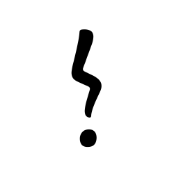
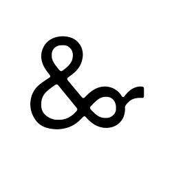
An unconventional punctuation mark intended to convey irony.
An unconventional punctuation mark intended to convey irony. Specifically designed to be easy to write by hand and to resemble existing punctuation marks.
Designed in 2007 by Bas Jacobs for the Dutch organization Collectieve Propaganda van het Nederlandse Boek (CPNB).
Source: Popova, Maria. "Ironic Serif: A Brief History Of Typographic Snark And The Failed Crusade For An Irony Mark." The Marginalian, Sept. 2013, tinyurl.com/mvrmdz8c. Accessed Mar. 2024.
- 58 Views
Graphical characteristics:
Asymmetric, Open shape, Monochrome, Contains both straight and curved lines, Has no crossing lines.
Category: Language Symbols.
Ironieteken is part of the Punctuation group.
More symbols in Punctuation:
Punctuation marks are symbols that indicate the structure and organization of written language, as well as intonation and pauses to be observed when reading aloud. In written English, punctuation is… read more »
More symbols in Language Symbols:
Citation
Use the citation below to add this symbol to your bibliography:
Style:MLAChicagoAPA
"Ironieteken." Symbols.com. STANDS4 LLC, 2025. Web. 22 Jan. 2025. <https://www.symbols.com/symbol/ironieteken>.



Have a discussion about Ironieteken with the community:
Report Comment
We're doing our best to make sure our content is useful, accurate and safe.
If by any chance you spot an inappropriate comment while navigating through our website please use this form to let us know, and we'll take care of it shortly.
Attachment
You need to be logged in to favorite.
Log In