What's the meaning of the Green Bay Packers Logo »
Green Bay Packers Logo
This page is about the meaning, origin and characteristic of the symbol, emblem, seal, sign, logo or flag: Green Bay Packers Logo.
Needing to outfit his new squad, team founder Curly Lambeau solicited funds from his employer, the Indian Packing Company. He was given $500 for uniforms and equipment in return for the team being named for its sponsor. An early newspaper article referred to the fledglings as "the Indians", but by the time they played their first game "Packers" had taken hold.
Indian Packing was purchased in 1920 by the Acme Packing Company. Acme continued to support the team, which played its first NFL season with "ACME PACKERS" emblazoned on its jerseys.
Lambeau, a Notre Dame alumnus, borrowed its Irish's navy blue and gold team colors, much as George Halas borrowed his Illinois alma mater's for the Chicago Bears. As a result, the early Packers were often referred to as the "Bays" or the "Blues" (and even occasionally as "the Big Bay Blues").
By 1950, Green Bay had changed its colors to hunter green and gold. Navy blue was kept as a secondary color, seen primarily on sideline capes, but was quietly dropped on all official materials shortly thereafter. The team's current uniform combination of forest green or white jerseys and metallic gold pants was adopted soon after Vince Lombardi arrived in 1959. However, to celebrate the NFL's 75th anniversary in 1994, the Packers joined in a league-wide donning of "throwback" jerseys, back to navy blue and gold. The team would go throwback again for two Thanksgiving Day games against the Detroit Lions, in blue and gold 1930s-era uniforms in 2001, and 1960s green and gold (only slightly different from the current ones) in 2003.
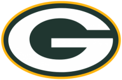
In 1951, the team finally stopped wearing leather helmets, adopting the metallic gold plastic headgear it has used ever since. The oval "G" logo was added in 1961 when Lombardi asked Packers equipment manager Gerald "Dad" Braisher to design a logo. Braisher tasked his assistant, St. Norbert College art student John Gordon. Satisfied with a football-shaped letter "G", the pair presented it to Lombardi, who then approved the addition.
Tiki Barber falsely reported it to stand for "greatness" without a reliable source to back up his claims. Other reputable media outlets then published similar stories using Barber's false claim as a source.
The Packers' Assistant Director of PR and Corporate Communications had the following to say: "There’s nothing in our history that suggests there's any truth to this. The Packers Hall of Fame archivist said the same thing." The team used a number of different logos prior to 1961, but the "G" is the only logo that has ever appeared on the helmet. The Packers hold the trademark on the "G" logo, and have granted limited permission to other organizations to utilize a similar logo, such as the University of Georgia and Grambling State University. Adopted in 1964, the Georgia "G", though different in design and color, was similar to the Packers' "G". Then-Georgia head coach Vince Dooley thought it best to clear the use of Georgia's new emblem with the Packers.[citation needed]
While several NFL teams choose to wear white jerseys at home early in the season due to white's ability to reflect the late summer sun rays, the Packers have done so only twice, during the opening two games of the 1989 season. However, the team did wear an all-white uniform in 2016 versus the Chicago Bears during the two teams' designated Color Rush game, in which Chicago wore all-navy uniforms. Although alternate gold jerseys with green numbers are sold on a retail basis, the team currently has no plans to introduce such a jersey to be used in actual games.
During the 2010 season, the Packers paid tribute to their historical brethren with a third jersey modeled after that worn by the club in 1929, during its first world championship season. The jersey was navy blue, again making the Packers "the Blues."
Upon the NFL's switch of uniform suppliers in 2012 to Nike from Reebok, the Packers refused any changes to their uniform in any way outside of the required supplier's logo and new league uniform logos, declining all of Nike's "Elite 51" enhancements, including retaining the traditional striped collar of the jersey rather than Nike's new collar design.
- 1,190 Views
Graphical characteristics:
Asymmetric, Closed shape, Colorful, Contains curved lines, Has no crossing lines.
Category: Sports symbols.
Green Bay Packers Logo is part of the National Football League group.

More symbols in National Football League:
The National Football League (NFL) is a professional American football league consisting of 32 teams, divided equally between the National Football Conference (NFC) and the American Football Conferen… read more »
More symbols in Sports symbols:
Symbols team logos and popular crests used in all kind of sports. read more »
Citation
Use the citation below to add this symbol to your bibliography:
Style:MLAChicagoAPA
"Green Bay Packers Logo." Symbols.com. STANDS4 LLC, 2025. Web. 23 Feb. 2025. <https://www.symbols.com/symbol/green-bay-packers-logo>.






Have a discussion about Green Bay Packers Logo with the community:
Report Comment
We're doing our best to make sure our content is useful, accurate and safe.
If by any chance you spot an inappropriate comment while navigating through our website please use this form to let us know, and we'll take care of it shortly.
Attachment
You need to be logged in to favorite.
Log In