What's the meaning of the Colorado Rapids Logo »
Colorado Rapids Logo
This page is about the meaning, origin and characteristic of the symbol, emblem, seal, sign, logo or flag: Colorado Rapids Logo.
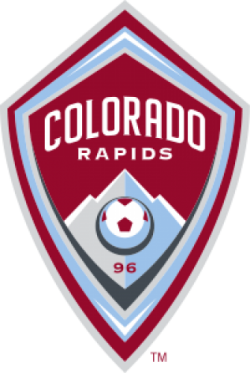
The Colorado Rapids are an American professional men's soccer team, based in the Denver suburb of Commerce City, Colorado. The Rapids compete in Major League Soccer, as a member of the Western Conference in the league. The franchise began play in 1996 as one of the charter clubs in MLS.
Colorado have won the MLS Cup in 2010, in their second MLS Cup appearance. The first appearance was in 1997, losing to D.C. United. They were also runners up of the Lamar Hunt U.S. Open Cup in the 1999 tournament, where they lost to the Rochester Raging Rhinos, being the last time a non-MLS team has won the tournament. The Rapids play their home games at Dick's Sporting Goods Park in Commerce City since its opening in the 2007 season.
The Rapids' image has evolved a great deal since their inaugural year. The team has undergone two complete re-brandings. Originally using green as the primary kit color, the team changed to black and blue for the 2003 season.
As Colorado were preparing to move into Dick's Sporting Goods Park for the 2007 season, the club re-invented themselves again to more closely align with the DNA and color scheme of other KSE teams, changing their colors to burgundy and blue, and creating a brand new shield logo to fit in with more traditional global soccer marks.
Colorado has had three logos in their history. They originally first used the "river" logo as their primary crest with the "circular" logo as a secondary one. In 2002, the two logos would switch, with the "circular" one becoming the primary. For the 2007 re-branding, the Rapids created the new shield-style logo, which is the one that is currently used today.
The original look of the Rapids sported a predominantly white kit with green trim, when the club's kit supplier was Puma. Other minor colors such as gold and blue were occasionally incorporated, with the club's association with Reebok. Eventually black became more heavily used and eventually overtook white as the more dominant color that accompanied the green, when the club switched to Kappa.
The Rapids underwent an image change prior to the 2003 season. Following the club's switch to Atletica, the kit colors switched to black and blue vertical stripes, similar to the uniforms worn by Italian Serie A club Internazionale. The blue and black vertical stripes remained almost unchanged when MLS adopted Adidas as their league wide kit sponsor.
- 968 Views
Graphical characteristics:
Asymmetric, Closed shape, Colorful, Contains curved lines, Has no crossing lines.
Category: Sports symbols.
Colorado Rapids Logo is part of the Major League Soccer group.
More symbols in Major League Soccer:
Major League Soccer (MLS) is a men's professional soccer league, sanctioned by U.S. Soccer, that represents the sport's highest level in both the United States and Canada. MLS constitutes o… read more »
More symbols in Sports symbols:
Symbols team logos and popular crests used in all kind of sports. read more »
Citation
Use the citation below to add this symbol to your bibliography:
Style:MLAChicagoAPA
"Colorado Rapids Logo." Symbols.com. STANDS4 LLC, 2025. Web. 22 Jan. 2025. <https://www.symbols.com/symbol/colorado-rapids-logo>.


Have a discussion about Colorado Rapids Logo with the community:
Report Comment
We're doing our best to make sure our content is useful, accurate and safe.
If by any chance you spot an inappropriate comment while navigating through our website please use this form to let us know, and we'll take care of it shortly.
Attachment
You need to be logged in to favorite.
Log In