What's the meaning of the Sporting Kansas City Logo »
Sporting Kansas City Logo
This page is about the meaning, origin and characteristic of the symbol, emblem, seal, sign, logo or flag: Sporting Kansas City Logo.
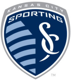
Sporting Kansas City is an American professional soccer club based in Kansas City, Missouri, playing its home games in Kansas City, Kansas.The club competes as a member of the Western Conference in MLS. Sporting KC began play in 1996 as a charter team in the league, then known as the Kansas City Wiz. The team was founded by Lamar Hunt in 1995. Since moving across the state line, they have been the only major professional sports league franchise to play their home games in Kansas.
For the majority of their existence, the franchise were known as the Kansas City Wizards. The team rebranded in November 2010, coinciding with its move to their home stadium, now known as Children's Mercy Park.The franchise has won the MLS Cup twice (2000, 2013), the Supporters' Shield in 2000, and the U.S. Open Cup in 2004, 2012 and 2015.
Sporting Kansas City's official colors are "sporting blue" and "dark indigo" with "lead" as a tertiary color.[citation needed] The primary logo is composed of a teardrop-shaped shield containing a stylized representation of the Kansas-Missouri state line with "sporting blue" stripes on the "Kansas" side and an interlocking "SC" on the "Missouri" side. The shield's contour alludes to the team's former logo while under the "Kansas City Wizards" appellation. The stateline represents Sporting's fanbase in both of the Kansas and Missouri portions of the Kansas City metropolitan area. The eleven alternating horizontal stripes of "sporting blue" and "dark indigo" forming the state line are a nod to the number of players a team fields. The "SC" (for Sporting Club) is inspired by Asclepius' rod representing health and fitness, a Greek statue called the Winged Victory of Samothrace – alluding to strength and movement, and to the Spanish architecture of Kansas City's Country Club Plaza.Beginning in 2013, Ivy Funds became the club's first kit sponsor, and a new home and away jersey design was unveiled, as well as an alternate argyle design.
- 1,393 Views
Graphical characteristics:
Asymmetric, Closed shape, Colorful, Contains curved lines, Has crossing lines.
Category: Sports symbols.
Sporting Kansas City Logo is part of the Major League Soccer group.
More symbols in Major League Soccer:
Major League Soccer (MLS) is a men's professional soccer league, sanctioned by U.S. Soccer, that represents the sport's highest level in both the United States and Canada. MLS constitutes o… read more »
More symbols in Sports symbols:
Symbols team logos and popular crests used in all kind of sports. read more »
Citation
Use the citation below to add this symbol to your bibliography:
Style:MLAChicagoAPA
"Sporting Kansas City Logo." Symbols.com. STANDS4 LLC, 2025. Web. 16 Jan. 2025. <https://www.symbols.com/symbol/sporting-kansas-city-logo>.



Have a discussion about Sporting Kansas City Logo with the community:
Report Comment
We're doing our best to make sure our content is useful, accurate and safe.
If by any chance you spot an inappropriate comment while navigating through our website please use this form to let us know, and we'll take care of it shortly.
Attachment
You need to be logged in to favorite.
Log In