What's the meaning of the Steelers Logo »
Steelers Logo
This page is about the meaning, origin and characteristic of the symbol, emblem, seal, sign, logo or flag: Steelers Logo.
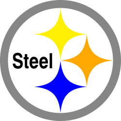
The Steelers logo is based on the Steelmark logo belonging to the American Iron and Steel Institute (AISI). Created by U.S. Steel Corp. (now known as USX Corp.), the logo contains three hypocycloids (diamond shapes).
In the 1950s, when helmet logos became popular, the Steelers added players' numbers to either side of their gold helmets. Later that decade, the numbers were removed and in 1962, Cleveland's Republic Steel suggested to the Steelers that they use the Steelmark as a helmet logo.
When the Steelmark logo was created, U.S. Steel attached the following meaning to it: Steel lightens your work, brightens your leisure and widens your world. The logo was used as part of a major marketing campaign to educate consumers about how important steel is in our daily lives. The Steelmark logo was used in print, radio and television ads as well as on labels for all steel products, from steel tanks to tricycles to filing cabinets.
In the 1960s, U.S. Steel turned over the Steelmark program to the AISI, where it came to represent the steel industry as a whole. During the 1970s, the logo's meaning was extended to include the three materials used to produce steel: yellow for coal, orange for ore and blue for steel scrap. In the late 1980s, when the AISI founded the Steel Recycling Institute (SRI), the logo took on a new life reminiscent of its 1950s meaning.
The Steelers had to petition the AISI in order to change the word "Steel" inside the Steelmark to "Steelers" before the logo was complete.
The Steelers are the only NFL team that sports their logo on only one side of the helmet. At first, this was a temporary measure because the Steelers weren't sure they would like the look of the logo on an all-gold helmet. They wanted to test them before going all-out.
Equipment manager Jack Hart was instructed to put the logo only on one side of the helmet - the right side. The 1962 Steelers finished 9-5 and became the winningest team in franchise history to date. The team finished second in the Eastern Conference and qualified for the Playoff Bowl. They wanted to do something special for their first postseason game, so they changed the color of their helmets from gold to black, which helped to highlight the new logo.
Because of the interest generated by having the logo on only one side of their helmets and because of their team's new success, the Steelers decided to leave it that way permanently.
Today's helmet reflects the way the logo was originally applied and it has never been changed.
- 3,075 Views
Graphical characteristics:
Asymmetric, Closed shape, Colorful, Contains curved lines, Has no crossing lines.
Category: Sports symbols.
More symbols in Sports symbols:
Symbols team logos and popular crests used in all kind of sports. read more »
Citation
Use the citation below to add this symbol to your bibliography:
Style:MLAChicagoAPA
"Steelers Logo." Symbols.com. STANDS4 LLC, 2024. Web. 4 Dec. 2024. <https://www.symbols.com/symbol/steelers-logo>.



Have a discussion about Steelers Logo with the community:
Report Comment
We're doing our best to make sure our content is useful, accurate and safe.
If by any chance you spot an inappropriate comment while navigating through our website please use this form to let us know, and we'll take care of it shortly.
Attachment
You need to be logged in to favorite.
Log In